|
Charting Data
Tutorial donated by Wayne Tschirhard
Purpose
The purpose of this tutorial is to teach basic spreadsheet skills
Data Relationship
The first thing you need is data that shows a relationship. Examples include
mathematical functions, stock market prices over time, rainfall over time,
statistical divisions of a population, or divisions of an income that make
up a budget. Since math is something that anyone can duplicate, we'll use
the sine function:
-
Go to the bottom of your workbook and click on Sheet2.
-
Type X in A1.
-
Type Sine(X) in B1.
-
Enter 0 in A2. (That's a zero. Click anywhere on the Spreadsheet to unselect “A2”
after entering the “0”.)
-
Select A2. (Click on A2 again to select it.) Drag-copy A2 down until you see
the tool tip number read 90. (Put the cursor over the box at the bottom right corner of "A2". When you see a  , click on it and drag it down until you see the tool tip number read 90 then release the click. The numbers will increase by 1 for every
line you drag over.) (The number 90 will be in cell A92) , click on it and drag it down until you see the tool tip number read 90 then release the click. The numbers will increase by 1 for every
line you drag over.) (The number 90 will be in cell A92)
-
Go back to the top and Select B2. (Ctrl+up arrow is a quick way to move up.)
-
Enter =SIN(A2).
-
Click on the bottom right corner of the B2 cell. (The "B2" cell contents change from the formula "=SIN(A2)"
into a "0".) Drag-copy the formula all the way down to the 90 in the A column.
Don't worry if you don't know what the numbers mean; we aren't concerned
with that. The order of the columns matters. Spreadsheet programs typically
assume that the column on the left is the variable that is plotted on the
horizontal (x) axis of the chart, and the column on the right is the variable
that is plotted on the vertical (y) axis.
Insert Chart
-
Select columns A and B.
-
Click the Insert Chart,  , icon on the Function Toolbar. (The pointer changes to , icon on the Function Toolbar. (The pointer changes to . Click anywhere on the spreadsheet. Or Click Insert > Chart... The "AutoFormat Chart" window appears.) . Click anywhere on the spreadsheet. Or Click Insert > Chart... The "AutoFormat Chart" window appears.)
-
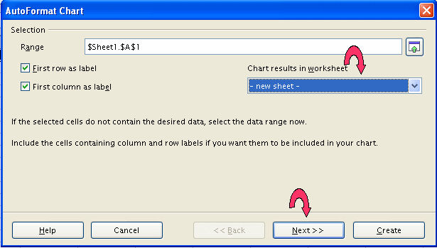
Select -New Sheet- from the drop-down box labeled Chart results in worksheet.
-
Click Next>>>.
-
Select XY Chart.  (Hold the cursor over the icons to find it.) (Hold the cursor over the icons to find it.)
-
Click Next>>>.
-
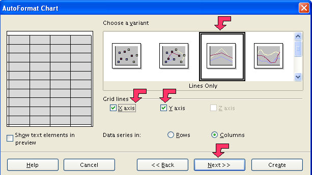
Select Lines Only and check the X axis and Y axis grid line boxes. ("Y" may already be checked. Don't uncheck it.)
-
Click Next>>>.
-
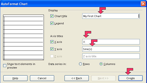
Give the chart a title, My First Chart, in the box that has Main Title in it. (Replace text.)
-
Click the X axis and Y axis check boxes.
-
Type X for X axis title, and Sine(x) for Y axis title. (Replace existing text.)
-
Click Create.
-
Look at the worksheet tabs at the bottom.
-
Click on the last tab. (Probably labeled Sheet4.)
-
Use the little boxes on the corners to resize the chart by clicking on
them and dragging them until you like the proportions.
Appearance Of Chart
Charts created by spreadsheet programs are unappealing most of the time.
You have to mess with the format of the chart elements to make them look
better.
The first thing I notice is a jagged plot line. That is appropriate for
some data, but the sine function is a smooth function, so make the following
changes:
-
Double-click somewhere on the chart if you see green boxes or no boxes.
-
Click Format > Chart Type...
-
Select Cubic Spline,  , from the Variants box at the bottom. , from the Variants box at the bottom.
-
Click OK.
That's better, but it could still use some improvement. Try:
-
Click Format > Chart Wall.
-
Click the Area tab. In the dialog box below Fill, click the  and select None. Click OK. and select None. Click OK.
-
Place the cursor over the data plot line and double-click. (The smooth Purple line.)
-
Click the Line tab. In the Color dialog box, change the color to Sea Blue.
-
In the Width dialog box, change the width to .02. (Click the repeatedly or highlight the number in the dialog box and type ”.02”.)
Click OK.
-
Select Format > Grid > All Axis Grids...
-
Change the Color to Gray 40%. (You have to scroll down the palette.) Click OK.
-
The chart still seems busy. Select Format > Axis > X Axis. Click the Scale tab.
-
Clear the Maximum check box and replace 90 with 45. Click OK.
-
Change the main title text to Sine Function by double-clicking on it and editing it.
-
When you are done, click somewhere else on the chart to accept the changes.
-
Click on a worksheet cell. Click Format > Sheet > Rename. (The “Rename Sheet” window appears.) Rename the sheet, Sine Graph.
-
Save your work. (Click “File > Save”.)
Summary
You just used most of the chart editing commands. The point is that you
can change every aspect of the chart in some fashion. To get good at it,
you'll have to experiment with the settings and develop your own style.
NOTE
Tutorials are improved by input from users. We solicit your constructive
criticism.
Click here to E-mail your suggestions and comments
Edited by Sue Barron
Charting Data 09/14/07
Last modified: 2008.04.25 20:33 UTC
|

